This is a bit of a long one, and I apologize in advance.
Something I’ve been somewhat frustrated with is the vast divide in HF propagation information. Either there’s a high-level graphic (and major kudos to N0NBH for providing this ubiquitous quick-reference snapshot — it’s loaded up here on the website, and I use it every time I power up the station!) or there’s an incredibly detailed, voluminous lyceum of arcane tools to dig through.
What I want is something in between. A quick reference like the N0NBH graphic that provides just a little bit more detail, and one that also represents band conditions in my specific location/use case.
Sooo… I’ve been working on it, and I’ve reached a point where I’m somewhat confident in the data, so I thought I’d share.
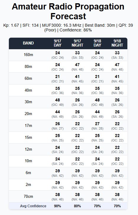
This represents the most detailed look at the data. I intend to simplify it, I but wanted to demonstrate what was all included under the hood.
This is the QSO Probability Index (QPI). It’s a percentage (0-100) that represents the probability that I’m going to make some decent contacts and have a good time on a particular band at a particular time. So, if I look at tomorrow, I can hop on 20 meters and have a pretty average day. In finer print underneath each entry, it shows the region that is performing best (North America, South America, Europe, Africa, Asia, or Oceana).
I can convert these numbers to the usual Closed/Poor/Fair/Good/Excellent fare, or maybe I’ll replace them with the little smiley faces we see on the doctor’s office pain chart. 🙂
For those interested in what’s under the hood, I’m pulling data from the following sources:
- NOAA Space Weather Prediction Center (raw observation data)
- Australian Space Weather Forecasting Centre (raw observation data)
- HamQTH Aggregation Services (DX Cluster/Spot Data)
- PSK Reporter Activity Network (for weak signal/digital activity evidence)
- Reverse Beacon Network (via HamQTH for CW activity evidence)
This data is all aggregated and run through a series of functions that either model data or add real world activity validation to improve confidence in a forecasted model.
The QPI calculation combines four weighted components, with weights that vary slightly by band type due to how they interact with the ionosphere:
- Model Viability (M): Propagation physics and ionospheric models
- Space Weather Stability (S): Geomagnetic and solar disruption factors
- Diurnal/Geometry (D): Time-of-day and path geometry effects
- Activity Evidence (A): Real-world activity data validation
I also have these models looking at the maidenhead grid square for latitude and longitude, as well as ERP (rough values for antenna and transmitter output power). So, the above is for my home, 100 watts output, on a dipole antenna with 7dBi gain.
Anyway, I thought I’d share a little of what I’ve been up to in my few spare minutes and was curious about feedback. If this gets pared down a bit, would you find use in it? Is there a particular way you could see where this might come in more useful than the image we already have in the sidebar? (Me, I like the idea that I can play space weather forecaster and have a rough idea of what tomorrow’s radio fun looks like.)
Any chance you could embed this chart on our website here? I would be useful to check before going out portable or even in deciding rather or not to try for that rare DX or wait until tomorrow.
Hey, if people find it useful, that’s absolutely next on my list. I’m trying to find a clean way to present the data. Today’s conditions and tomorrow’s forecast, based on that model, look pretty phenomenal around 20-15m, and I’d like to have some real-world validation. (No better than folks like you and KD8JSP out there doing POTA to confirm!)